
Pantone’s Fashion Color Trends for Autumn/Winter 2025/26 (LFW): A Stylist’s Playbook
- Louisa Gabriel

- Aug 25, 2025
- 5 min read
If you’re a personal stylist or image consultant already thinking about how the colors of your clients’ wardrobes will shift when the weather cools, you’re not alone. I've been taking a look at Pantone's Autumn/Winter 2025/26 color forecast from London Fashion Week (yes, there's a different palette from New York's Fashion Week), and it’s packed with shades that feel both fresh and familiar. This season’s palette mixes earthy comfort colors with unexpected pops of brightness—the kind of hues that make outfits feel modern without being intimidating.
According to Pantone, these shades are about more than fashion—they’re about personal expression and identity. That makes them especially exciting for us as stylists and image consultants, because it means we can help clients use color not just to look good, but to feel authentic and confident.
In this post, I’ll walk you through the 10 key standout colors and the 5 seasonless neutrals from Pantone’s London Fashion Week report, along with tips on who they suit best, how to style them, and how to translate them into real-life wardrobes your clients will love.
The Meaning Behind The Colors
Color isn’t just about aesthetics—it reflects the cultural mood of the moment. Pantone’s London Fashion Week Autumn/Winter 2025/26 palette arrives at a time when clients are craving both comfort and freshness in how they present themselves. After several seasons of minimalism and “quiet luxury,” this palette introduces shades that feel rooted in tradition but open the door to reinvention.
Think of Hot Chocolate, Dark Gull Gray, and Chocolate Martini as grounding colors—they provide the safety net clients need when building wearable wardrobes. These hues reassure, bringing warmth and familiarity to day-to-day dressing. On the other hand, accents like Salted Lime, Lavender Blue, and Poppy Red inject energy and personality, encouraging people to step into bolder self-expression.
Pantone itself describes this season as one that blends “creativity, innovation, heritage, and change to spark a new vision.” That balance is key for us as stylists and image consultants. It means we can help clients build wardrobes that honor their style DNA (heritage neutrals, tried-and-true staples) while nudging them towards colours that represent who they’re becoming (unexpected brights, nuanced jewel tones).
The 10 Standout Colors: Mood, Match & Styling Moves
Pantone highlights a rich palette that merges nostalgia with reinvention: earthy warmth, soft pastels, vibrant accents, and rich neutrals.
1) Lavender Blue – PANTONE 14-3905 TCX

Vibe: Airy lilac-tinted blue that radiates calm ease.
Best on: Summers and Light Springs; ideal for soft layering.
Style it: Try in scarves, silk blouses, or fine knits—spruce up navy or sand basics for a gentle lift.
2) Desert Sun – PANTONE 16-1149 TCX

Vibe: Tawny orange-tan evoking sun-baked landscapes.
Best on: Warm-toned clients (Autumn/Spring).
Style it: Suede skirts, wool trousers, or coats—pairs beautifully with Crown Blue or Wispy Clouds.
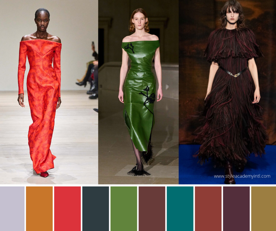
3) Poppy Red – PANTONE 17-1664 TCX

Vibe: A lively, celebratory red; both sensual and bright.
Best on: Winters and Clear Springs are ready for statement pieces.
Style it: Work into blazers, trench trims, or standout dresses. Add Dark Gull Gray for a grounding effect.
4) Magical Forest – PANTONE 19-4908 TCX

Vibe: Mysterious, shadowy green; grounded and elegant.
Best on: Deep Autumns, Winters with affinity for rich jewel tones.
Style it: Long coats, velvet trousers, chunky knits—speak heritage with a modern twist.
5) Salted Lime – PANTONE 17-0232 TCX

Vibe: Citric, playful green—fresh and surprising. FashionUnited
Best on: Springs keen to inject vibrancy; cool neutrals who love a pop.
Style it: Think accessories—belts, knit hats—or tonal details on bags or shoes.
6) Hot Chocolate – PANTONE 19-1325 TCX

Vibe: Comforting, indulgent chocolate brown.
Best on: Neutral-warm clients seeking safe but luxe swaps for black.
Style it: Outerwear, knitwear, suiting—especially with Salted Lime or Lavender Blue for contrast.
7) Fanfare – PANTONE 18-4936 TCX

Vibe: Bold green with composed elegance.
Best on: Winters, cool Summers, looking for refined color tone.
Style it: Statement blouses, luxe knits, and accessories—anchors down with Dark Gull Gray.
8) Chili Oil – PANTONE 18-1440 TCX

Vibe: Robust red-brown; seasoned and earthy.
Best on: Autumns and warm neutrals.
Style it: Milled fabrics, structured coats, boots—lift with Wispy Clouds or Crown Blue.
9) Fig – PANTONE 19-1718 TCX

Vibe: Fruity yet woody purplish-brown; exotic and rich.
Best on: Deep Winters and Soft Summers.
Style it: Bias skirts, velvet, statement knits—balance with Crown Blue or Wispy Clouds.
10) Bronze Mist – PANTONE 17-0843 TCX

Vibe: Warm brown with a subtle shimmer; antique, quiet glam
Best on: Warm neutrals.
Style it: Evening tops, accessories, shimmer accents—harmonise with Hot Chocolate or Magical Forest.
The 5 Seasonless Shades: Your Year-Round Staples
These neutrals anchor wardrobes and enable seamless mixing of standout hues.


Wispy Clouds – PANTONE 11-3900: Silky, delicate off-white with sheen.
Dark Gull Gray – PANTONE 18-0403: Resilient, grounding staple—almost black.
Crown Blue – PANTONE 19-3926: Classic blue foundation for year-round style.
Cumulus Cloud – PANTONE 14-0207: Soft, rainy-day grey; comforting and versatile.
Chocolate Martini – PANTONE 19-1216: Rich, velvety brown with maximum sophistication.
How to Utilize LFW AW 25/26 Colors Across Client Seasonal Palettes
Warm Undertones (Autumns & Springs): Lean into Desert Sun, Hot Chocolate, Chili Oil, Bronze Mist, and Seasonless Browns. Neutral option? Try Chocolate Martini instead of black.
Cool Undertones (Winters & Summers): Shine in Lavender Blue, Poppy Red, and Fanfare. Ground with Dark Gull Gray and contrast using Wispy Clouds or Cumulus Cloud.
Neutral/Leaning Skin Tones: Build on seasonless staples, then punctuate with Magical Forest or Salted Lime in accessories to test color reaction.
The Perfect Fabric & Finish Pairings
Soft & Sheen: Lavender Blue or Fanfare in silk, satin, or lightweight knits for a romantic look.
Texture & Weight: Hot Chocolate and Bronze Mist in corduroy, brushed twill, or suiting for tactile anchoring.
Statement Shine: Magical Forest or Salted Lime accessories with patent detail—emphasis without overwhelm.
Evening Glow: Fig and Poppy Red in velvet or plush knits—ideal for polished evening moments.
Capsule Formulas Easy To Recreate
Urban Minimalist (Cool): Dark Gull Gray coat + Lavender Blue silk top + Crown Blue trousers + Wispy Clouds ankle boots.
Heritage Cozy (Warm): Hot Chocolate midi sweater dress + Bronze Mist belt + Salted Lime scarf + brown boots.
Creative Balanced (Neutral): Cumulus Cloud wide-leg trousers + Lavender Blue top + Magical Forest blazer—tonal meets vivid.
Final Thoughts for Personal Stylists & Image Consultants
The Autumn/Winter 2025/26 LFW palette embodies poise, depth, and renewal, offering stylists and consultants a refined color vocabulary. Build looks on seasonless neutrals (Wispy Clouds, Dark Gull Gray, Crown Blue, Chocolate Martini) and accent them with key shades—Lavender Blue for serenity, Poppy Red for energy, Magical Forest for grounding—creating client wardrobes that feel both authentic and future-facing.
Happy Autumnal Styling 🍂
Louisa 💕
Start your career in style with The Style Academy International®, a global leader in education and training for personal stylists and image consultants.
Color swatches courtesy of the Pantone Color Institute