
Pantone’s Fashion Color Trends for Spring/Summer 2026: A Guide For Personal Stylists
- Louisa Gabriel

- 3 days ago
- 4 min read
We may still be in the depths of Winter, but for personal stylists, the calendar is already moving forward. Spring/Summer 2026 wardrobe planning starts now, and as always, the most strategic place to begin is with color.
When it comes to fashion color forecasting, the Pantone Color Institute sets the global direction. Each season, their Fashion Color Trend Report for New York Fashion Week offers insight not just into what colors designers are using, but why those colors matter culturally, emotionally, and commercially. For Spring/Summer 2026, Pantone presents a palette that is expressive, optimistic, and deeply personal—designed to encourage individuality rather than conformity.
Pantone describes this season’s colors as ones that allow for experimentation, emotional connection, and personal interpretation—a perfect match for stylists focused on helping clients develop authentic, wearable wardrobes.

The Meaning Behind the Colors
Pantone frames Spring/Summer 2026 as a response to creative uniformity. Rather than rigid trends, the palette supports self-expression, playful contrasts, and emotional resonance. According to Pantone, these colors are meant to feel empowering and flexible, inviting people to “put their own stamp on fashion.”
For personal stylists and image consultants, this is a powerful shift. Instead of forcing clients into trend boxes, SS26 gives permission to mix bold with grounded, soften brights with refined neutrals, and tailor color stories to individual lifestyles, undertones, and confidence levels.
This is a season where color becomes a conversation—not a rulebook.
The 10 Standout Colors: Mood, Match, and Styling Moves
Pantone’s Spring/Summer 2026 NYFW palette balances energetic brights, emotional mid-tones, and elevated neutrals. Below are the standout colors, along with who they suit best and how personal stylists can translate them into real-world wardrobes.
Use this guide for capsule planning, personal shopping, seasonal edits, and content creation throughout spring and summer 2026.
Acacia — PANTONE 13-0640 TCX

Vibe: A radiant yellow with a green undertone—energetic, optimistic, and attention-drawing without feeling harsh.
Best on: Warm Springs and vibrant Autumns; ideal for clients who thrive in light and warmth.
Style it: Linen blazers, fluid dresses, or statement tops. Ground it with soft whites, sage greens, or deep browns to keep it wearable for everyday clients.
Marina — PANTONE 17-4041 TCX

Vibe: A calm, ocean-inspired blue that feels refreshing and composed.
Best on: Cool Summers and Winters; excellent for clients who want color without drama.
Style it: Tailored trousers, lightweight coats, shirting, or monochrome blue looks. It also works beautifully as a “new neutral” in professional wardrobes.
Muskmelon — PANTONE 15-1242 TCX

Vibe: A lively melon orange that feels juicy, modern, and joyful.
Best on: Springs and warm-leaning neutrals who enjoy playful color.
Style it: Casual dresses, relaxed tailoring, knit tops, or accessories. Balance with soft neutrals to avoid overwhelming color-shy clients.
Alexandrite — PANTONE 18-4835 TCX
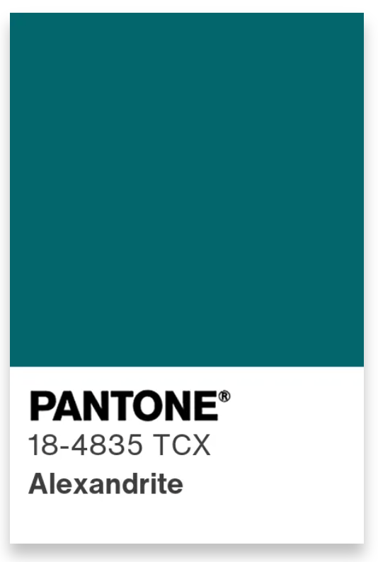
Vibe: A deep teal with emotional richness and visual depth.
Best on: Deep Winters and Autumns; ideal for clients who carry saturated colors effortlessly.
Style it: Statement blouses, fluid trousers, or minimalist dresses. Works beautifully in silk, satin, or structured tailoring.
Lava Falls — PANTONE 18-1552 TCX

Vibe: A powerful, emotionally charged red that feels bold yet refined.
Best on: Winters and Clear Springs.
Style it: Use as a focal point—dresses, blazers, or statement accessories. Pair with cool blues or deep browns to maintain balance.
6) Dusty Rose — PANTONE 17-1718 TCX

Vibe: A softened pink with elegance and restraint.
Best on: Soft Summers and Light Springs; flattering close to the face.
Style it: Blouses, scarves, knitwear, or fluid skirts. Ideal for clients who want femininity without sweetness.
Tea Rose — PANTONE 16-1620 TCX

Vibe: A deeper rose with warmth and emotional presence.
Best on: Neutral and cool-leaning clients who want richness without heaviness.
Style it: Dresses, knit tops, or tonal layering with blues and soft browns.
Amaranth — PANTONE 19-2410 TCX

Vibe: A saturated purple that feels artistic and expressive.
Best on: Winters and confident Summers.
Style it: Statement pieces, eveningwear, or editorial looks. Best used intentionally rather than as a base color.
Burnt Sienna — PANTONE 17-1544 TCX

Vibe: Earthy, grounded, and warm with a natural sophistication.
Best on: Autumns and warm neutrals.
Style it: Trousers, leather accessories, relaxed suiting, and elevated casual wear.
Burnished Lilac — PANTONE 15-1905 TCX

Vibe: A muted lavender with a vintage, refined quality.
Best on: Cool palettes, particularly Summers.
Style it: Knitwear, blouses, or layered under neutrals for subtle color impact.
The Seasonless Shades

Pantone balances the expressive SS26 colors with seasonless neutrals designed to anchor wardrobes and extend longevity. These shades are essential for clients who prefer subtlety or are building foundational capsules.
Think clean whites, grounded browns, refined blues, soft beiges, and natural greens—colors that support bold statements without competing with them.
These shades are invaluable for:
Minimalist clients
Transitional wardrobes
Color-shy or confidence-building styling journeys
How to Use SS26 Colors Across Client Seasonal Palettes
Warm Undertones (Spring & Autumn): Lean into Acacia, Muskmelon, Burnt Sienna, warm browns, and soft greens. These colors enhance warmth and feel naturally cohesive.
Cool Undertones (Summer & Winter): Prioritize Marina, Dusty Rose, Tea Rose, Burnished Lilac, and cool blues. Add crisp white for brightness and clarity.
Neutral / Undetermined Undertones: Start with seasonless shades, then introduce color through accessories, tops, or layering pieces. This approach builds confidence without overwhelming clients.
The Perfect Fabric & Finish Pairings
Light & Airy: Use brights like Muskmelon and Acacia in cotton, linen, and lightweight knits.
Soft Structure: Alexandrite, Marina, and Amaranth shine in tailored silhouettes and fluid suiting.
Natural Texture: Burnt Sienna and warm neutrals feel elevated in leather, woven fabrics, and relaxed tailoring.
Capsule Formulas You Can Use Immediately
Modern Minimal: Marina trousers + white tee + soft beige blazer + neutral trainers.
Creative Professional: Burnished Lilac blouse + deep blue trousers + structured brown bag.
Confident Statement: Lava Falls dress + clean white accessories + minimal gold jewellery.
Final Thoughts for Personal Stylists & Image Consultants
Spring/Summer 2026 is not about chasing trends—it’s about curated self-expression. Pantone’s NYFW palette gives stylists permission to lead with personalization, emotional resonance, and real-world wearability.
By anchoring wardrobes in seasonless neutrals and introducing color with intention, personal stylists can help clients feel current without feeling costume-driven. This is a season where color becomes a styling tool—not a rule—and that’s exactly where great personal style begins.
Happy Spring Styling!
Louisa 💕
Start your career in style with The Style Academy International®, a global leader in education and training for personal stylists and image consultants.
Color Swatch Images Courtesy of the Pantone Institute