
Pantone’s Fashion Color Trends for Fall/Winter 2025/26 (NYFW): A Stylist’s Guide to What’s Next
- Louisa Gabriel

- Aug 26, 2025
- 5 min read
Updated: Sep 2, 2025
We may still all be enjoying the warm days of Summer and sipping margaritas, but it's officially time for personal stylists to start planning their clients' wardrobes for the upcoming Fall/Winter season. To officially start the planning, let's talk about color!
As every personal stylist and image consultant knows, when it comes to fashion color trends, the Pantone Institute leads the way! Pantone’s Fashion Color Trend Report shows us what's in store for each fashion season, and for New York Fashion Week Fall/Winter 2025/26, they've delivered a palette that’s rich, tactile, and quietly glamorous—designed to feel both familiar and new. As Leatrice Eiseman, Executive Director of the Pantone Color Institute, puts it, the season’s colors are “approachable and accessible,” balancing reinvention with ease.

The Meaning Behind The Colors
Pantone views FW 25/26 as a season of poetic nuance: a meeting of comfort and subtle elegance that feels tailor-made for clients seeking authenticity over spectacle. The palette “intertwines familiar shades with those expressing hope for the future,” encouraging individualized looks rather than rigid rules. For stylists, that translates to permission to customize—to mix heritage browns with modern blues, to soften winter with Primrose Pink, and to let a single powerful red carry a look.
The 10 Standout Colors: Mood, Match, and Styling Moves
Pantone’s Fall/Winter 25/26 NYFW palette is a conversation between deep, dramatic tones and soft, enlivening notes—think seductive reds, grounded browns, and nuanced blues punctuated by luminous green and delicate pink.
Below, you’ll find the 10 standout colors plus the 5 "seasonless" shades, along with what they signal, who they suit, and exactly how to style them for real clients. Use this as your working guide for capsule wardrobe planning, personalized styling, personal shopping, and even content creation from August through February.
1) Lemon Grass — PANTONE 12-0626 TCX

Vibe: A lemon-infused green with a floral softness; fresh yet not loud.
Best on: Springs and light/clear Warm palettes; adds lift to neutral-heavy wardrobes.
Style it: Pair with French Roast or Hot Chocolate for a polished look; mix with soft ivory knits; translate to accessories (beanies, crossbody) for color-shy clients.
2) Brandied Melon — PANTONE 16-1340 TCX

Vibe: A muted, spiced orange with lingering warmth—think retro glamor without the shout.
Best on: Warm clients (Spring/Autumn), especially with golden undertones.
Style it: Suede skirts, nubby tweeds, and leather trim. Offset with Vapor Blue for a modern, cool-warm tension.
3) Lyons Blue — PANTONE 19-4340 TCX

Vibe: A deeply tinted teal that reads luxurious and heritage.
Best on: Winters and Deep Autumns who carry saturation well.
Style it: Velvet tailoring, satin evening blouses, or a statement overcoat. Works beautifully with Bronze Brown and Poppy Red accents.
4) Damson — PANTONE 18-1716 TCX

Vibe: Intensely plummy purple with vintage drama and contemporary polish.
Best on: Winters, Deep Autumns, and some Soft Summers (as a lip or micro-print).
Style it: Rib-knit dresses, bias-cut satin skirts, or merino roll-necks; ground with Crown Blue or Bright White for clarity.
5) Primrose Pink — PANTONE 12-2904 TCX

Vibe: Soft, delicate pink that gently illuminates—romantic but wearable.
Best on: Light Spring/Summer clients; a face-framing shade in blouses and scarves.
Style it: Layer under charcoal suiting, or combine with Vapor Blue for an air-brushed pastel duo.
6) Winterberry — PANTONE 17-1640 TCX

Vibe: Sultry red—sumptuous and sensory without skewing festive.
Best on: True Winters and Clear Springs who suit clean, vibrant reds.
Style it: Tailored midi dresses, cashmere crews, or a smooth leather clutch. Add Lyons Blue or Crown Blue for depth.
7) Hot Chocolate — PANTONE 19-1325 TCX

Vibe: Comforting cocoa brown; indulgent and grounding.
Best on: Warm and neutral undertones; a terrific black alternative for Everyday Chic clients.
Style it: Double-breasted coats, Chelsea boots, and soft suiting. Pairs elegantly with Lemon Grass and Primrose Pink.
8) Chili Oil — PANTONE 18-1440 TCX

Vibe: Robust, seasoned red-brown—earthy but energized.
Best on: Autumn clients; adds sophistication to relaxed silhouettes.
Style it: Corduroy, shearling details, and matte leather. Use Bright White for a crisp, editorial contrast.
9) Poppy Red — PANTONE 17-1664 TCX

Vibe: Exuberant true red: sensual, celebratory, and camera-ready.
Best on: Winters and Clear Springs; powerful in small accessories for everyone else.
Style it: Red-on-red monochrome is runway-ready; for day, break with French Roast or Crown Blue.
10) Bronze Brown — PANTONE 18-0937 TCX

Vibe: Lustrous golden brown—evokes natural ores and quiet luxury.
Best on: Warm clients; stunning against textured knits and brushed wool.
Style it: Statement belts, pleated trousers, and structured bags; lift with Lemon Grass or balance with Vapor Blue.
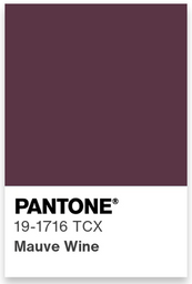
The 5 "Seasonless" Shades
Pantone core "seasonless" shades from NYFW Fall/Winter 25/26 lean classic and luxurious: Bright White, French Roast, Vapor Blue, Crown Blue, and Mauve Wine. These shades will help to anchor the bolder seasonal colors for Fall/Winter 2025/26, providing the more color-shy clients with a more comforting and muted look.


Bright White — PANTONE 11-0601 TCX: Optical, clarifying, and the perfect clean slate. Use for shirting, sneakers, and contrast piping.
French Roast — PANTONE 19-1012 TCX: Full-bodied brown with earthy luxe. Elevates basics and pairs with every red in the palette.
Vapor Blue — PANTONE 14-4203 TCX: A hazy, unobtrusive blue-gray; brilliant as a modern neutral.
Crown Blue — PANTONE 19-3926 TCX: Dependable, long-life classic blue—timeless in outerwear and denim suiting.
Mauve Wine — PANTONE 19-1716 TCX: Refined, softly dramatic; beautiful for eveningwear, lipstick, and accessories.
How to Use AW 25/26 Colors Across Client Seasonal Palettes
For Warm Undertones (Springs & Autumns): Lean into Brandied Melon, Lemon Grass, Chili Oil, Bronze Brown, French Roast, Hot Chocolate. Keep metals warm (gold/bronze). If clients want red, Poppy Red works for Clear Springs; Winterberry for deeper warmth styled with brown neutrals.
For Cool Undertones (Summers & Winters): Champion Lyons Blue, Damson, Crown Blue, Vapor Blue, Primrose Pink. Add Bright White for crispness. Cool clients who crave a statement can try Poppy Red or Winterberry; ground with Crown Blue rather than brown.
For Neutral/Leaning Undertones: Reach for the "seasonless' shades first. Then add the bolder colors in accessories: a Primrose Pink scarf, Lyons Blue tote, or Brandied Melon beanie. This lets you test tolerance for warmth/coolth without overcommitting. It's also the perfect approach for styling clients who have yet to gain their color confidence.
The Perfect Fabric & Finish Pairings
Matte + Plush: Use Hot Chocolate or French Roast in felted wools and brushed twills for plush minimalism.
Lustrous Accents: Lyons Blue and Damson sing in satin, velvet, or silk blends—ideal for evening capsules or elevated office.
Heritage Textures: Bronze Brown and Chili Oil in corduroy, herringbone, and leather nod to tradition while feeling current.
Airy Neutrals: Vapor Blue and Bright White in crisp poplin or fine-gauge knitwear keep winter looks light and photogenic.
Capsule Formulas You Can Copy & Paste
City Minimalist (Cool): Crown Blue tailored coat + Bright White shirt + Damson knit skirt + black knee boots. Add a Poppy Red lip for pop.
Quiet Luxury (Warm): Hot Chocolate knit dress + Bronze Brown belt + Lemon Grass scarf + textured gold hoops. Understated, tactile, expensive-looking.
Creative Professional (Neutral): Vapor Blue wide-leg pants + Primrose Pink silk blouse + French Roast blazer. Finish with Lyons Blue tote.
Final Thoughts for Personal Stylists & Image Consultants
Fall/Winter 25/26 is about elevated ease: colors that feel wearable, luxurious, and quietly confident. Build wardrobes on seasonless cores (Bright White, Crown Blue, Vapor Blue, French Roast, Mauve Wine) and punctuate with one or two standouts per outfit—Lyons Blue for depth, Poppy Red for impact, Lemon Grass for lift, Winterberry for sultry warmth. The result? Client wardrobes that look exquisite, transition from day to night, and feel personal rather than prescriptive—exactly the point of this season’s palette.
Happy Fall Styling! 🍂
Louisa 💕
Start your career in style with The Style Academy International®, a global leader in education and training for personal stylists and image consultants.
Color Swatch Images Courtesy of the Pantone Institute