
Fall 2026 Color Trends: Why This Season Is Breaking the Rules of Autumn Dressing

For years, we have been conditioned to think of fall fashion in a fairly predictable way.
As soon as the temperature drops, the fashion world reaches for camel, chocolate, burgundy, rust, olive and cream. The colors change, but the formula remains remarkably familiar.
Fall 2026 is making that formula much more interesting.
This season, traditional autumn shades are still very much part of the picture, but they are being joined by vivid blues, energetic pinks, surprising yellows and greens that feel far removed from the conventional fall palette.
Pantone's Autumn/Winter 2026–2027 New York Fashion Week report captures this tension particularly well, describing a palette that places earthy tones and considered neutrals alongside vivid, expressive colors.
And that makes Fall 2026 particularly interesting for personal stylists, color analysts, and image consultants.
Because this isn't really a season about finding the perfect fall color. It's about understanding how to make seasonal fashion work for the individual.
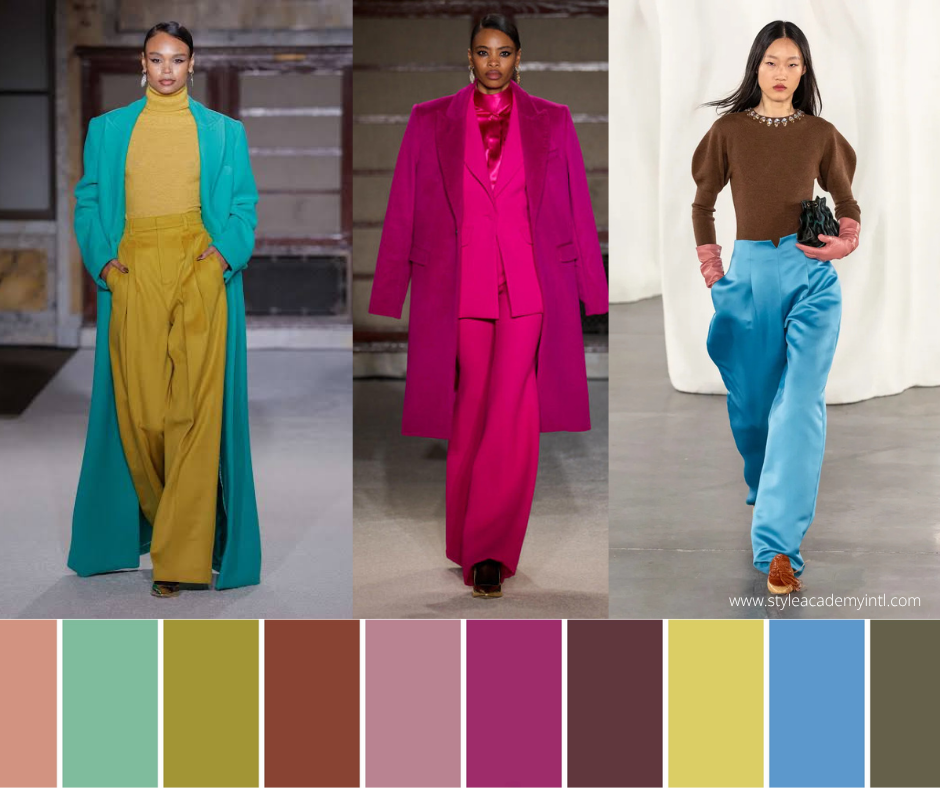
Fall 2026 Is Not Giving Us One Color Story
One of the easiest mistakes to make when discussing fashion color trends is to treat a trend report as a shopping list.
This is the color of the season. Buy it.
But look more closely at the Fall 2026 palette, and something else is happening.
There isn't one obvious mood.
There is contrast.
Deep, earthy shades sit alongside bright, high-energy colors. Muted tones sit next to saturated ones. Warm colors compete with cool ones. Traditional autumn shades are being disrupted by colors that, quite frankly, don't seem to have received the memo that it's Fall.
That reflects a wider shift happening in fashion.
The Fall/Winter 2026 runways are moving away from the restrained, minimalist aesthetic that dominated much of the recent fashion conversation and toward something more expressive. British Vogue describes the season as embracing fantasy, storytelling and whimsy, while Vogue notes the renewed emphasis on contrast and personality.
Color is a major part of that change.
So rather than asking:
"What are the colors for Fall 2026?"
A more useful question for a stylist is:
"What is happening to color this season, and how can I interpret it for my client?"
Brown Is Still Important...But It Has Competition

Let's start with the obvious.
Brown isn't disappearing.
And why would it? It has become one of the most useful modern wardrobe neutrals, offering considerably more depth and personality than the black-and-beige combination that dominated minimalist dressing for so long.
Pantone's Fall 2026 palette includes Arabian Spice and Toffee, two very different interpretations of brown. Arabian Spice is deeper and more enveloping, while Toffee functions as a softer, versatile neutral.
But the more interesting development is what happens around the brown.
Instead of building an entire outfit in beige, brown, and cream, designers are using brown as a backdrop for bolder colors.
Imagine a rich brown coat with a vivid blue knit.
A chocolate skirt with a saturated pink.
A toffee-colored bag with an unexpected yellow accent.
This is a different way of thinking about the autumn neutral.
Brown doesn't have to be the destination. It can be the canvas.
The styling opportunity
For clients who already have a strong collection of brown and camel pieces, this season doesn't necessarily require a wardrobe overhaul.
Instead, consider introducing one unexpected color.
A new scarf.
A handbag.
A knit.
A pair of shoes.
One carefully chosen color can make familiar pieces feel completely different.
Red Is Getting Deeper, and More Complicated

Red continues to have a strong presence for Fall 2026, but we're seeing more nuance than simply "wear red."
Pantone's Red Mahogany sits somewhere between a rich red and a deep brown, creating a shade that feels grounded rather than overtly bright.
Elsewhere on the runways, stronger reds are also making an impact. Recent fashion coverage has highlighted tomato and bright reds among the season's notable color directions.
This gives stylists a useful opportunity to demonstrate something clients often struggle with:
There isn't one red.
Red can be:
Warm or cool
Bright or muted
Light or deep
Orange-based or blue-based
Soft or highly saturated
So when a client says, "I can't wear red," the answer may simply be that they haven't found their red yet.
That's where professional color analysis becomes much more useful than a generic trend forecast.
Blue Is Refusing to Wait Until Spring

Perhaps one of the most interesting developments for Fall 2026 is the prominence of blue.
Pantone's All Aboard is a vibrant maritime blue, while other runway reports have identified strong blues and cobalt-like shades as important directions for the season.
This challenges one of the assumptions we often make about seasonal dressing: that autumn must be warm.
Of course, autumn fashion doesn't have to be warm.
A client's coloring doesn't change because the leaves do.
For a cool-toned client, blue may actually offer a more natural way to participate in Fall 2026 fashion than forcing them into rust, mustard, or orange simply because those colors feel "seasonal."
And even for a warm-toned client, blue can create an interesting contrast.
Try a vivid blue with:
Chocolate brown
Camel
Cream
Deep red
Olive
Warm grey
The result can feel much more modern than a traditional autumn palette.
For color analysts
This is an excellent client education opportunity.
Seasonal fashion and seasonal color analysis are not the same thing.
"Fall fashion" describes what is happening in fashion at a particular time of year.
"Your best colors" describe what harmonizes with an individual.
Those two things can overlap beautifully—but they don't have to.
Pink Hasn't Finished Its Story

If you thought pink had reached its peak, Fall 2026 has other plans.
Pantone includes Festival Fuchsia, a highly expressive pink-purple, alongside Foxglove, a softer, more muted mauve-pink.
That pairing is fascinating because it demonstrates two completely different approaches to the same color family.
Festival Fuchsia says, "Look at me."
Foxglove says, "Look a little closer."
For stylists, that difference matters.
One client may thrive in the energy and saturation of a vivid fuchsia. Another may look considerably more harmonious in a softened mauve.
And this is where a trend becomes much more useful than a list of trends.
Instead of telling clients:
"Pink is trending."
You can ask:
"Which pink makes sense for you?"
That small change in language moves the conversation from fashion consumption to personal style.
Yellow Is Having an Unexpected Autumn Moment

Yellow isn't necessarily the first color you associate with fall. But Acacia, included in Pantone's Fall 2026 palette, is a vivid, green-infused yellow that brings an unexpected burst of energy to the season.
It is precisely the kind of color that can make a traditional autumn wardrobe feel less predictable. But it also illustrates why stylists shouldn't treat trend colors as universal recommendations.
A high-energy yellow may be fantastic on one client and completely overpowering on another.
That doesn't mean the second client has to sit out the trend.
Instead, consider:
A softer yellow
A warmer or cooler variation
A printed piece containing the color
Accessories
Shoes
A handbag
A color combination where the yellow is less dominant
The goal isn't to recreate the runway. The goal is to capture the trend's feeling.
Green Is Splitting Into Very Different Directions

Green is another major color family for Fall 2026, but it isn't one unified trend.
Pantone's palette includes Neptune Green, Green Envy, and Burnt Olive, offering three distinctly different interpretations.
This is important because green is one of those color families where relatively small changes in undertone can make a dramatic difference.
A blue-green can feel completely different from an olive.
A yellow-green creates a very different impression from a deep forest green.
A muted green behaves differently from a highly saturated one.
For a color analyst, this is exactly the sort of distinction that clients need help understanding.
A client doesn't necessarily need to know the technical terminology.
But they benefit enormously from learning:
"This is why you love green but don't love every green."
The Most Interesting Fall Colors May Be the Ones That Don't Look Like Fall
This is perhaps the biggest story of the season.
Fashion's traditional autumn palette is based largely on nature:
Falling leaves.
Earth.
Wood.
Spices.
Warm light.
But Fall 2026 is increasingly willing to step outside that visual reference.
Vivid blue.
Fuchsia.
Green-infused yellow.
Aquatic green.
These colors don't necessarily look like the landscape outside your window in October. And that is exactly what makes them feel fresh.
Trend forecasting research for Fall/Winter 2026/2027 similarly points toward a tension between grounded earthy shades and expressive vibrancy, describing the season as one of emotional depth, material richness, and energetic color.
The result is a much broader interpretation of what autumn dressing can look like.
So What Does This Mean for Color Analysts and Stylists?
This is where Fall 2026 becomes particularly valuable. Because the season gives us a chance to move the conversation around color analysis away from rules.
One of the most common misconceptions about color analysis is that your seasonal palette dictates everything you can and cannot wear.
But professional color analysis should give clients more options, not fewer.
If a client sees Festival Fuchsia everywhere and it isn't one of their most harmonious colors, there are several ways forward.
Find a related shade.
Use it away from the face.
Use it in a print.
Use it as an accent.
Combine it with a buffer color.
Or simply admire it without wearing it.
The same applies to Acacia, All Aboard, Red Mahogany, or any other trend shade.
The skill is not memorizing which trend belongs to which season.
The skill is understanding color characteristics and knowing how to translate them.
A Better Way to Use Trend Reports With Clients
Instead of bringing a list of Fall 2026 colors into a wardrobe consultation and asking which ones your client likes, try a different approach.
Start with the color story
Show your client the broader direction of the season.
Is it more expressive?
More contrasting?
More saturated?
More tonal?
Then identify which aspects appeal to them.
Perhaps they don't actually like fuchsia.
Perhaps they like the energy of fuchsia.
That is a very different piece of information.
Look at their existing wardrobe
Before recommending anything new, look for colors they already own.
You may discover that your client already has the foundations for the season. They simply haven't been combining them in a new way.
Find the bridge color
This is one of the most useful techniques a stylist can use.
If your client's wardrobe is predominantly neutral, find one color that ties their existing pieces to the new season.
For example:
Brown → Red
Camel → Acacia
Navy → All Aboard
Olive → Fuchsia
One bridge color can completely change the way an existing wardrobe feels.
Personalize the trend
Finally, ask:
Does this color actually belong in this client's wardrobe?
Not because it is "their season." Because it makes sense for their coloring, personality, lifestyle, and style identity.
That is the difference between styling someone and simply following fashion.
Fall 2026 and the End of "One Palette Fits All"
There is another reason I think this season is particularly interesting for image professionals. Clients are becoming increasingly comfortable with the idea that personal style doesn't have to fit neatly into one aesthetic. The same is happening with color. Someone can love neutrals and vivid color. They can wear monochrome one day and maximalist color combinations the next. They can have a carefully edited wardrobe and still own one completely impractical, gloriously bright coat. And they can appreciate a trend without adopting it wholesale.
The Fall 2026 runways reflect that same freedom.
The season isn't telling us to choose between minimalism and maximalism.
Between neutrals and color.
Between practicality and creativity.
Instead, it is encouraging us to combine them.
The Fall 2026 Color Palette, Reinterpreted
If we strip away the individual trend names, I think the more interesting way to look at Fall 2026 is through color behavior.
The grounded colors
Brown, clay, olive and warm neutrals.
These provide familiarity and wardrobe longevity.
The expressive colors
Fuchsia, vivid red, strong yellow and bright blue.
These bring personality and visual impact.
The softer colors
Mauve, cream and muted neutrals.
These provide balance.
The unexpected colors
Aquatic greens, vivid blues and green-infused yellows.
These are the colors that stop the season from becoming predictable.
And that gives stylists something much more valuable than a list of "must-have" colors.
It gives us a framework for creating combinations.
What We Should Leave Behind This Fall
Perhaps the biggest shift for Fall 2026 is what we're leaving behind. We can leave behind the idea that autumn has to mean: rust + camel + brown + burgundy.
We can leave behind the idea that every client needs to adopt the same seasonal palette.
We can leave behind the idea that a trend color is automatically flattering.
And we can definitely leave behind the idea that telling a client "you can't wear that" ends the conversation.
Instead, we can ask better questions.
What is it about this color that you love?
What characteristics make it work—or not work—for you?
How could we reinterpret it?
Where could we use it?
Those questions are much more valuable than simply identifying whether a color is "in."
The Real Fall 2026 Color Trend? Choice.

There are plenty of beautiful colors to choose from this season.
Red Mahogany.
Muted Clay.
Burnt Olive.
All Aboard.
Festival Fuchsia.
Acacia.
Foxglove.
Arabian Spice.
But the most important trend isn't any one of them. It is choice.
Fall 2026 gives us permission to stop treating seasonal color as a formula. For stylists, that means more creative combinations. For color analysts, it means more opportunities to demonstrate the value of personalization. And for clients, it means something even better: They don't have to choose between following fashion and being themselves. They can do both. Because the best use of a trend isn't to make everyone look the same. It's to give people new ideas for expressing who they already are.
Happy Styling!
Louisa 💕